Design system for low code development in Mendix
YoungCapital expanded their development stack from high code to low code using Mendix. To ensure consistency of the YoungCapital brand throughout the high and low code applications the out-of-the-box design system of Mendix needed to be tailored. Because low code development speeds up the development process massively due to the building blocks and widgets it comes with, a solid component library in Figma is a must have to be able to deliver UI’s timely.
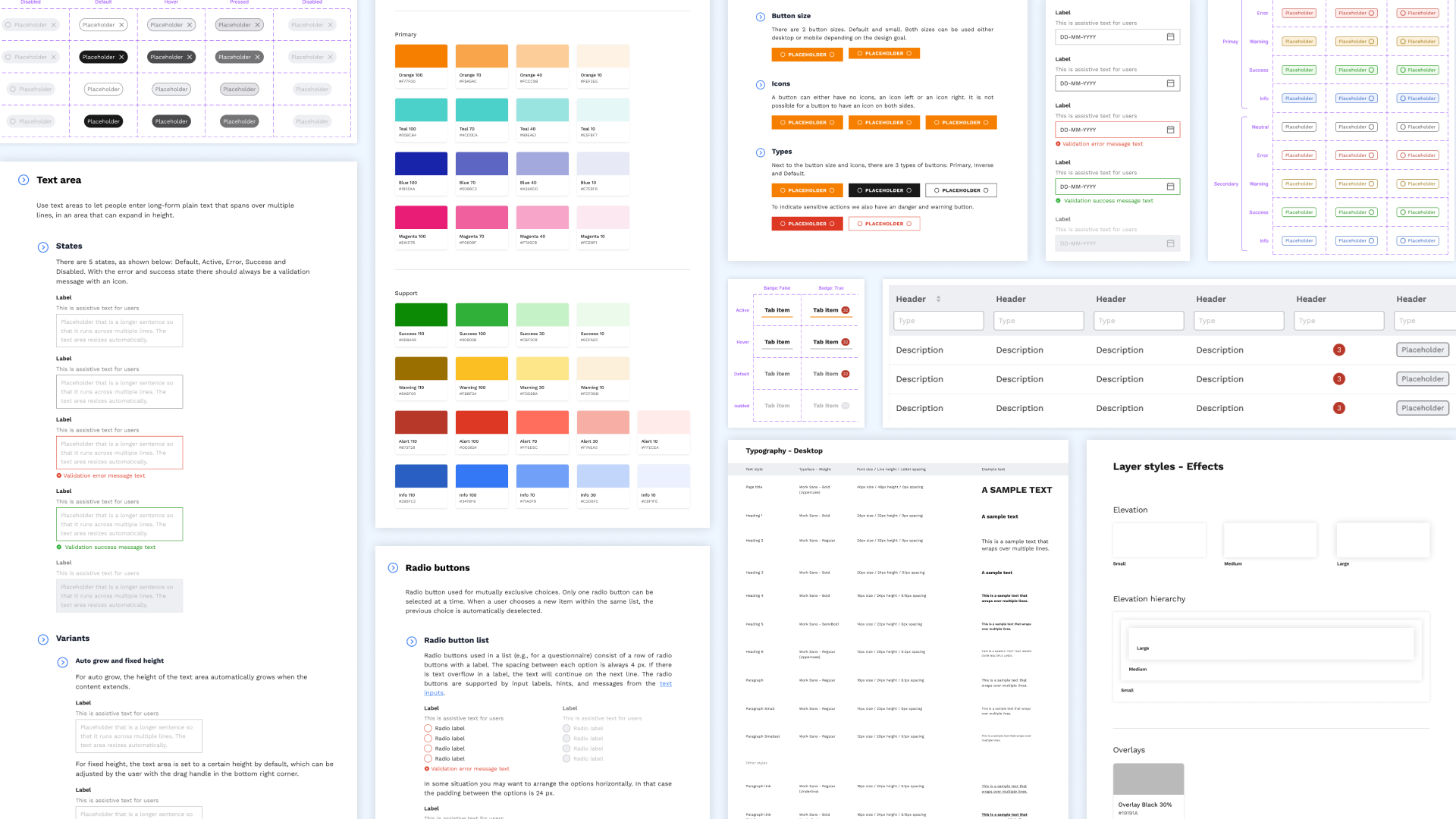
Goal: Create a Design System in Figma that embodies the YoungCapital brand based on existing Mendix building blocks and widgets to ensure brand consistency, speed up the design process and facilitate a fast development process.
Tools: Figma, Mendix Studio Pro
Team: 2 UX designers, 1 Front-end developer, 2 Low code developers
My responsibility: I was responsible for coordinating this project as a whole and the main UX designer developing the Figma component library.
Approach
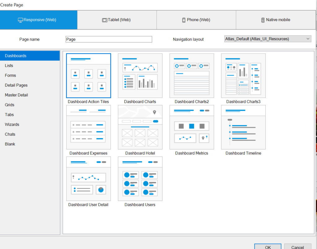
Learning the basics of Mendix
To gain a basic understanding of the benefits and restrictions of Mendix I participated in a 3 day Mendix course. Here I got to learn the benefits the default building blocks offer developers and the impact it has on the development speed and maintenance when you deviate from these standards. This came to be an important requirement throughout the development of the Design System: Stay as close as possible to the framework of the standard components.
Setting up the fundamentals
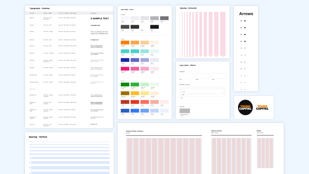
Because we are tailoring an existing Design System, small changes can have a big impact. To get a head start we started with adjusting the Mendix fundamentals (colors, typography, logo) to the ones from YoungCapital. Because we were developing tools for internal use at first, this made sure the developers could already start building with a basic YoungCapital look & feel.
Researching existing component libraries
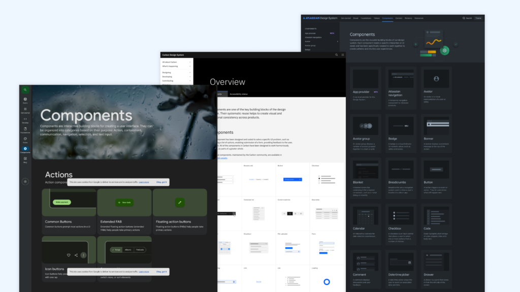
Once we started to expand the Figma component library inspiration was gained from best practices of other Design systems like Material Design, Atlassian Design System and Carbon Design System.
Testing & iteration
Diving deeper into the small building blocks presented some challenges. The Design System of Mendix comes with a fixed set of component variants, while we were used to more variants in YoungCapital High Code development. To ensure an optimal result, this needed a close collaboration between design & front-end development. We needed to try things out and tweak components to fit both the development and UX needs to cover the most common scenarios we might encounter.
Documentation & guidelines
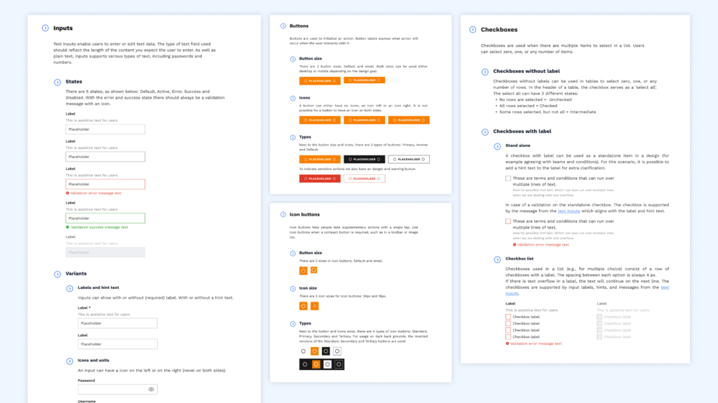
To ensure effective implementation & future scalability, we provided detailed documentation and usage guidelines in Figma. For this a close collaboration with the front-end developer was needed as well. To make sure developers can easily find the correct component variant in Mendix Studio Pro, we aligned the names between the components in Figma and their corresponding Mendix elements.
Expand components during projects
After we implemented the most important and most commonly used elements (like the navigation bar, headers, buttons, cards, input fields, etc.) we decided that further development of the Design System would be incorporated within the process of product development. That way, the design system can naturally grow every time a new element is needed and it becomes an integrated process.
Conclusion & Learnings
To gain a basic understanding of the benefits and restrictions of Mendix I participated in a 3 day Mendix course. Here I got to learn the benefits the default building blocks offer developers and the impact it has on the development speed and maintenance when you deviate from these standards. This came to be an important requirement throughout the development of the Design System: Stay as close as possible to the framework of the standard components.